

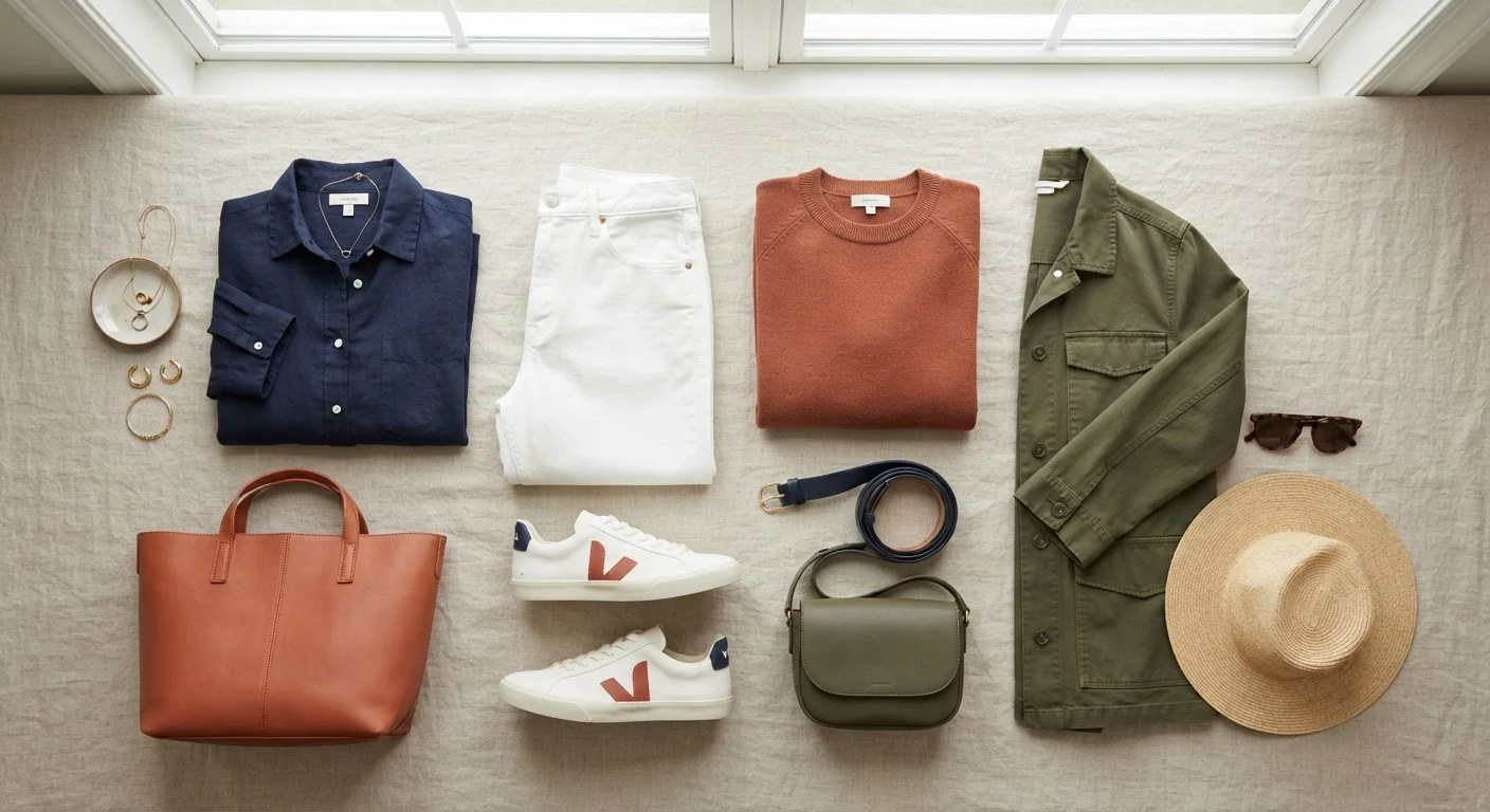
Why Color Relationships Matter More Than Instinct
Most people choose outfit colors by feel — grabbing what seems right and hoping it works. Sometimes it does. But when it doesn't, the problem usually isn't taste; it's that the colors are fighting each other in ways that are entirely predictable once you understand the underlying logic.
Color coordination isn't about memorizing rules. It's about recognizing a few reliable relationships so you can dress with intention rather than luck. Whether you're building a casual wardrobe from scratch or trying to get more mileage out of what you already own, these principles apply equally. And they cost nothing to learn.
If your outfits occasionally feel "off" for reasons you can't quite identify, common outfit missteps — including color conflicts — are often the culprit.
62%
of people who say color affects purchase decisions
Research published in the journal Management Decision found that color is a primary factor in product evaluation for a majority of consumers, highlighting how strongly color shapes perception.
90 seconds
time for a first visual impression to form
Studies on first impressions suggest that most initial assessments of a person or product are made within 90 seconds, with color playing a leading role in that rapid evaluation.
The Three Core Color Relationships
The color wheel organizes hues into a circular map that reveals three fundamental pairing strategies:
Complementary Colors
These sit directly opposite each other on the wheel — blue and orange, red and green, purple and yellow. Paired together, they create strong visual contrast that draws the eye. In casual dressing, this doesn't mean wearing fire-engine red with forest green; it means reaching for, say, a rust-toned top with indigo jeans, or a soft coral shirt with slate-blue trousers. Muted or desaturated versions of complementary pairs are far easier to wear than their full-intensity counterparts.
Analogous Colors
These are neighbors on the wheel — green, teal, and blue, for instance, or red, orange, and yellow. Because they share underlying hues, analogous combinations read as naturally harmonious. This is why an olive jacket over a sage shirt with tan chinos feels cohesive without trying too hard. The eye perceives the colors as part of the same family.
Tonal (Monochromatic) Dressing
This approach uses varying shades, tints, and tones of a single color. A charcoal blazer over a medium-gray tee with light-gray trousers is a tonal outfit. So is head-to-toe camel. The result feels modern and deliberate, and it's almost impossible to get wrong because the hue never changes — only its depth does.
The Role of Neutrals
Neutrals — white, black, gray, navy, beige, camel, and ivory — function as anchors. They don't compete with any color, which means they can ground almost any pairing and reduce visual noise. A well-built neutral wardrobe base lets you introduce one or two colored pieces per outfit without the combination feeling chaotic.
Think of it this way: if you're wearing a bold mustard yellow top, pairing it with white jeans is far simpler than pairing it with another saturated color. The white gives the eye somewhere to rest. Neutrals are also the foundation of most dress codes — something worth understanding if you navigate settings that require more than casual attire. Dress codes decoded explains how neutrals anchor more formal looks as well.
Build Your Neutral Base First
If you're unsure where to start, invest in two or three strong neutral pieces — a well-fitting white or light-gray tee, a pair of dark-wash or black trousers, and a navy or camel layer. From there, any single colored piece you add will have a reliable foundation to work against, making coordination far simpler without limiting your options.
Undertones: The Variable Most People Miss
Even when two colors have a logical relationship on the wheel, they can still feel mismatched if their undertones conflict. Undertones describe the subtle warmth or coolness embedded in a color. A beige can lean warm (peachy, golden) or cool (pinkish, ashy). Navy can be a warm navy with slight purple or a cool, greenish navy. When two pieces share the same undertone direction — both warm or both cool — they tend to sit well together even if they're different colors entirely.
This principle extends to how colors interact with your skin tone. Warm undertones in skin tend to harmonize with earthy, golden, and amber hues. Cooler undertones often respond well to clear blues, purples, and rose-based colors. Neutral undertones generally work across both camps. These are tendencies rather than strict prescriptions — your own observation is the most reliable guide.
Understanding how colors interact visually also connects to proportion and silhouette: how you distribute color across your body affects perceived shape. Proportion and silhouette principles explain the visual logic in more depth.
“Color is a power which directly influences the soul. It is the keyboard, the eyes are the hammers, and the soul is the piano with many strings.”
— Wassily Kandinsky, Artist and author of 'Concerning the Spiritual in Art' (1911)
Frequently Asked Questions
Tonal dressing — combining different shades of the same color — is widely considered the most forgiving starting point. Because all the hues share the same base, clashes are nearly impossible. A light blue shirt with medium-wash jeans and a navy jacket is a classic example.
Colors typically clash when they sit close on the color wheel but not close enough to be harmonious, or when they share conflicting undertones (one warm, one cool). If an outfit feels visually busy or jarring, try swapping one piece for a neutral to calm the combination.
No — color theory is a useful framework, not a rigid rulebook. Many successful outfit combinations break the "rules" deliberately. The wheel gives you a reliable starting point, especially when you're uncertain, but personal preference and context always matter.
Navy, white, gray, and camel are among the most versatile neutrals because they pair cleanly with a wide range of colors. Black works too, though it can feel more formal in casual contexts. The best neutral base depends on your skin's undertone and the colors you already own.
Skin undertones are generally described as warm (yellow, golden), cool (pink, blue), or neutral. Warm undertones often harmonize well with earthy tones like terracotta, olive, and mustard, while cool undertones tend to work well with jewel tones and blues. These are tendencies, not absolute rules.
Yes — keeping a shared color between patterns is one of the most reliable ways to make pattern mixing look intentional. See our <a href="/style-beauty/fashion-basics/pattern-mixing-the-unwritten-rules-and-when-it-actually-works">guide to pattern mixing</a> for more detail on how this works in practice.
The content on this site is for informational purposes only and is not a substitute for professional advice. Always consult a qualified professional for guidance specific to your situation.